Skypark
The brand for a premium airport car park, then a redesign of its website and booking flow. 23% fewer booking errors and 8% fewer abandoned bookings.
First, a car park that looked worth paying more for.
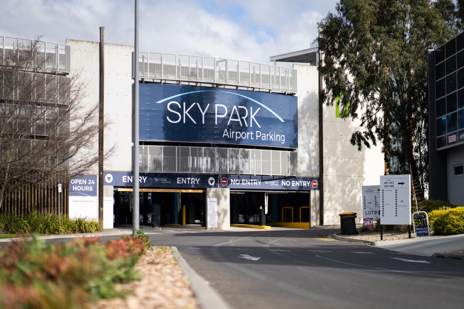
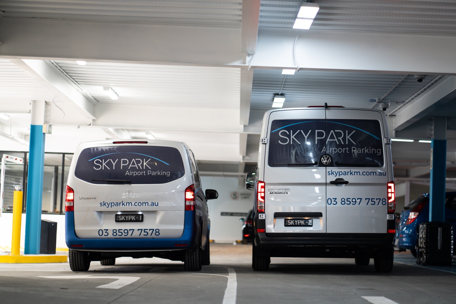
Skypark opened as a premium airport car park with one promise: a calm run from your car to the plane. My first job was to make that promise visible. I designed the brand identity, then carried it onto the signage on the building and the shuttle livery. You see the brand before you reach the gate.
Then the booking flow started costing them customers.
Customers kept typing wrong details into one long booking form and leaving halfway through it, and the site looked nothing like the car park. Skypark came back with a second brief: redesign the website and the booking flow so it matches the car park and turns more visits into bookings.
The usual car-park site
- A brochure site that lists prices and a phone number
- “Request a quote”, then wait for an email back
- A clunky third-party booking widget, off-brand and confusing
- Returning customers re-enter all their details
What Skypark runs on
- A site that answers travellers’ worries before they ask
- A live quote: enter your dates and see the price
- A branded booking flow in short steps
- Return customers book in a couple of clicks
- One brand from the signage to the confirmation screen
The site shows its proof before it asks for the sale.
You see the reviews, the ratings and the eight-minute shuttle before you see a form, so you have reasons to pick Skypark over the car park next door. Once you have a quote, you choose: book straight away, or read on until your questions are answered.
Four changes close the gap between “I’ll book” and “booked.”
The price comes first on the page.
Visitors have already seen the airport’s on-site price, and they want to know one thing: is this cheaper, and by how much? I put the quote at the top of the page and saved the sales pitch for after it.
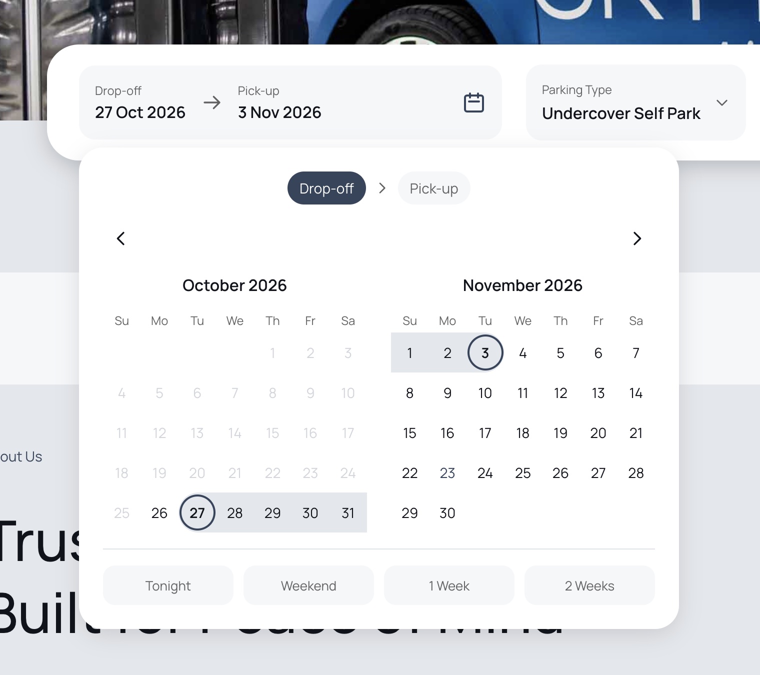
The date picker has Tonight / Weekend / 1 Week chips for regulars and budgeters who are comparing prices before they pick a date. One tap gives them a price without making up dates.
Booking picks up where the quote left off.
Your dates carry over from the quote, so you never type them twice. The booking flow switches to dark mode to mark the change: you’ve finished browsing and started booking.
Easy questions first, flight details last: 23% fewer errors.
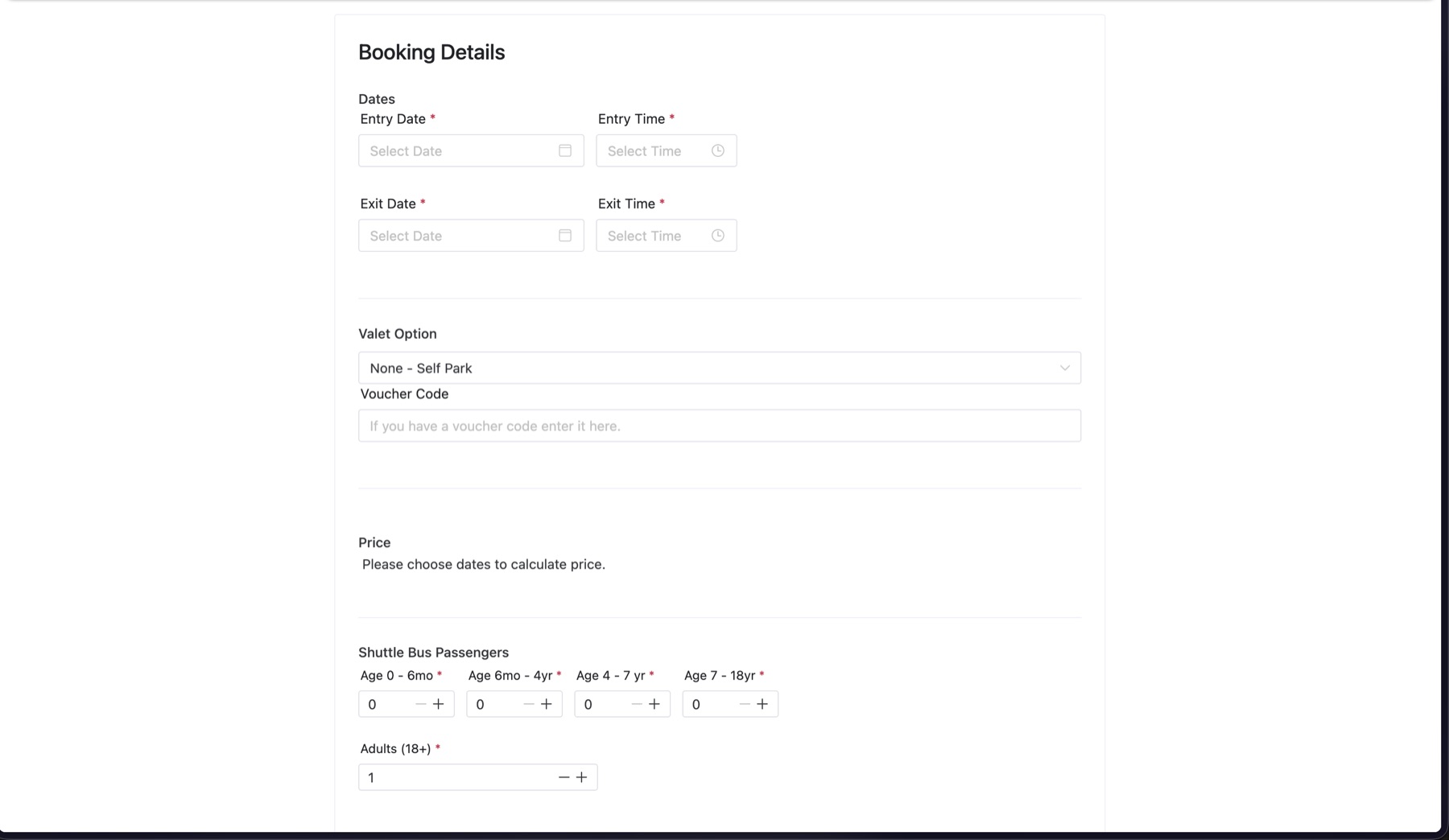
The old booking was one long form, and people typed anything into the flight fields to get through it. I split it into steps: dates and times first, then plate and return flight last. By then you’ve done the easy part and seen your price, so you look up the flight number instead of leaving to “come back later.” Moving those fields to the end cut errors 23% and abandoned bookings 8%.
Before: one long form
- Every field on one page, with the price stuck halfway down until you’d filled in dates
- Five required passenger counters, split by age, before you reached the flight details
- People typed junk into the flight fields to get past them, which caused most of the errors
After: short steps
- Dates and times first, then the price
- Plate and return flight last
- 23% fewer errors, 8% fewer abandoned bookings
The quote and booking both work on a phone.
People book from the couch or the departures queue, so I designed the quote and the booking to work as well on a small screen.
The car park delivers on what the site promises.
You drive up and the plate reader opens the gate. You park yourself or hand over the keys, and an on-demand shuttle gets you to the terminal in eight minutes. The signage and uniforms use the same brand as the confirmation screen.
Customers make fewer mistakes, and more of them finish booking.
Skypark was my first freelance project. I designed the brand first, then came back to redesign the website and booking flow, so the calm run from your car to the plane now starts at the quote.
Want something like this built? →